To curve text for laser engraving, you bend the baseline of the text along an arc instead of a straight line. Most laser software offers two ways: an arc setting that bends a text by a radius (positive for an arch, negative for a smile), and text on a path, which makes the letters follow any line or shape you draw. For a round coaster or badge, arch the top text, set the bottom text the other way so it still reads left to right, and give both the same radius so they sit in one even ring.
Below: when to use an arc and when to use a path, the radius math that makes text fit a circle, a complete tutorial in free software on a 100 mm coaster, and the mistakes that make curved text look wrong once it is burnt into wood.
Arc or path: two ways to curve text
Both methods give you text that is still text: you can change the words, the font or the size later, and the curve follows. Pick the one that matches the shape of your design.
| Text on an arc | Text on a path | |
|---|---|---|
| What it does | Bends the line of text by a radius | Makes the letters follow a shape you draw |
| Best for | Badges, coasters, logos, tags | Waves, spirals, ovals, a full circle, any outline |
| What you set | One number: the radius | The path, then an offset along it |
| Reading direction | Arch (positive) or smile (negative) | Follows the direction of the path |
| Editing the curve | Change the radius | Move the nodes of the path |
An arc is the fastest route for the classic round design: a name over the top of a coaster and a date under it. A path is for everything else, such as lettering along a wavy line on a cutting board, or around an oval plaque.
The radius math for text around a circle
The radius is the size of the circle the text bends around. To make text sit inside a round blank, start from the radius of the blank and take away what must stay clear.
- Blank radius: half the diameter. A 100 mm (about 4 in) coaster has a radius of 50 mm.
- Margin: the gap between the edge and the letters. 4 to 6 mm keeps the text clear of a cut line or of the rounded edge of a slate or wood slice.
- Letter height: the height of the capitals you choose, 8 to 10 mm on a coaster.
- Text radius = blank radius − margin − letter height. Here: 50 − 6 − 10 = 34 mm.
Use that radius for the top text, positive, with the letters standing on the arc. For the bottom text, use the same number, negative, and hang the letters from the arc: both texts then fill the same ring, the top one reading over the hump and the bottom one reading along the smile, both left to right.
How long can the text be?
The length of an arc is its radius times the angle in radians. On a 34 mm radius, half a circle is about 107 mm (34 × 3.14). A ten-letter word in 10 mm capitals takes roughly 70 to 80 mm, so it fills a little under half the ring and leaves room for a small gap on each side. If the text wraps too far down the sides, lower the letter height, reduce the spacing, or use a larger radius.
Rules of thumb
Capitals curve better than lowercase: their even height keeps the ring clean. Bold, simple fonts survive small sizes on wood; thin serifs and scripts below 5 mm tend to fill in.
Add a little letter spacing to text on the outside of a curve and none on the inside, where the letters close up.
How to curve text for laser engraving in Bernie
Bernie is free laser engraving and cutting software, funded by donations. Its drawing and text tools include text on an arc and text on a path. Here is the whole job on a round 100 mm coaster, with the mountains and the words from the screenshots: the outline is cut, the text and the drawing are engraved.
- Draw the blank. Choose the Ellipse tool (E) and drag with Shift held to draw a circle. In the inspector, set its size to 100 × 100 mm. If the coaster is already cut, draw it anyway as a guide on tool layer T1 (a long press on + next to Layers): it shows where the text goes and is never engraved.
- Add the top text. Choose the Text tool (T), click on the canvas and type your words, here LAKE HOUSE. In the inspector, pick a bold Font, set the Height to 10 mm, click Center and add 1 mm of Spacing.
- Arch it. Still in the inspector, type 34 in Arc Radius. A positive radius arches the text up; 0 makes it straight again. Leave Vertical Anchor on Baseline, so the letters stand on the arc.
- Add the bottom text. Create a second text, here EST. 2026, with a smaller height (8 mm). Type -34 in Arc Radius: a negative radius bends it into a smile, still reading left to right. Set Vertical Anchor to Top so the tops of the letters hang from the same circle as the top text.
- Center everything. Select a text and the circle, right-click and choose Align Horizontal Centers; do the same with the other text and with the artwork in the middle. Then move each text up or down until the gap to the edge is even all around: with the numbers above, about 6 mm.
- Set the layers. Put the text and the drawing on an engraving layer in Fill mode, and the circle on a cutting layer in Line mode if you cut the coaster out. Take a speed and power from the material library and check them with a Material Test on an offcut of the same wood.
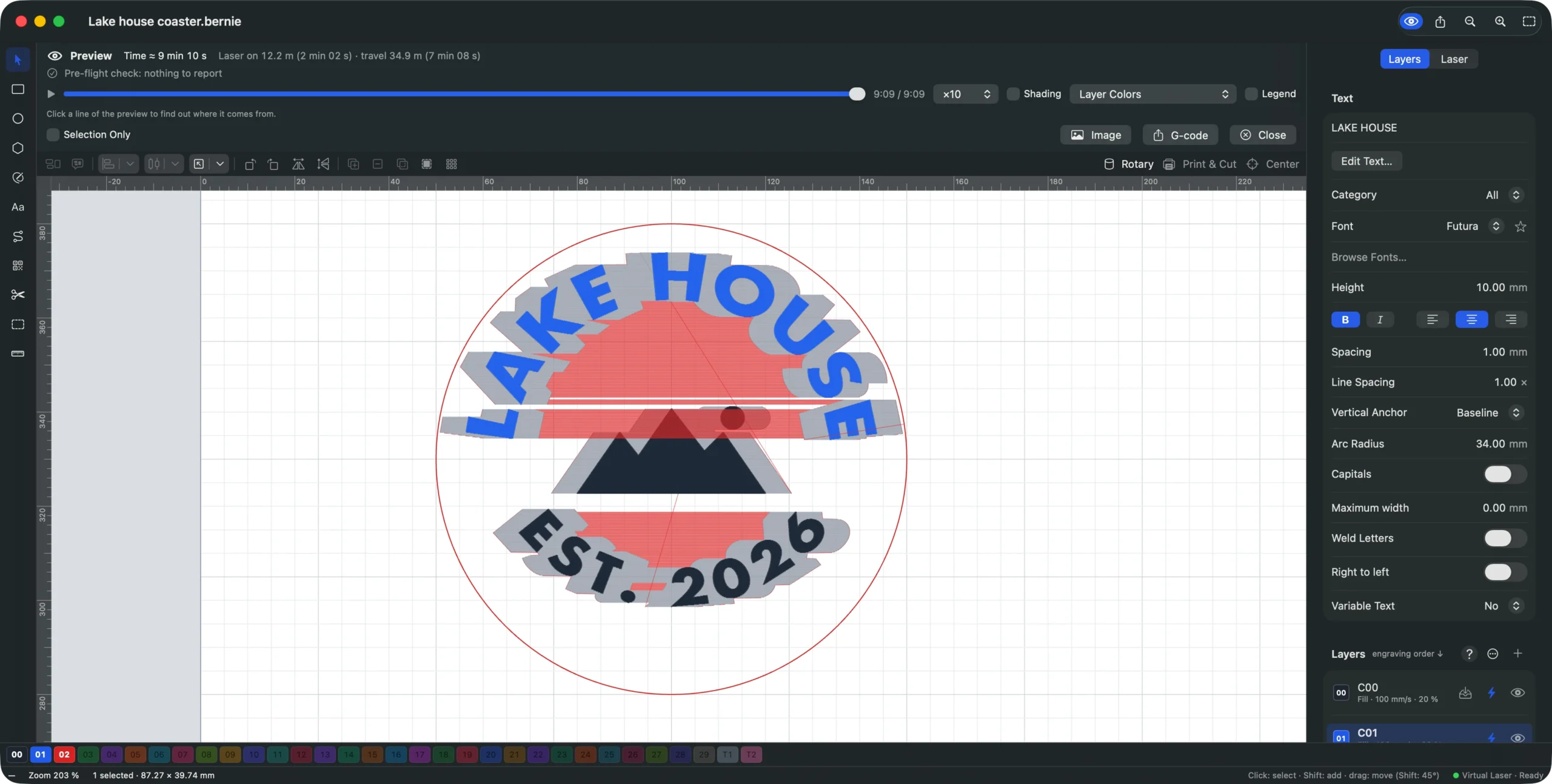
- Preview, frame and engrave. Turn on the preview to see the paths and the estimated time. Layers run from top to bottom of the list: keep the cut layer last (a long press on + offers Sort: Cuts Last), so the coaster does not move while it is engraved. Click Frame to watch the head trace the outline with the laser off, then Start.
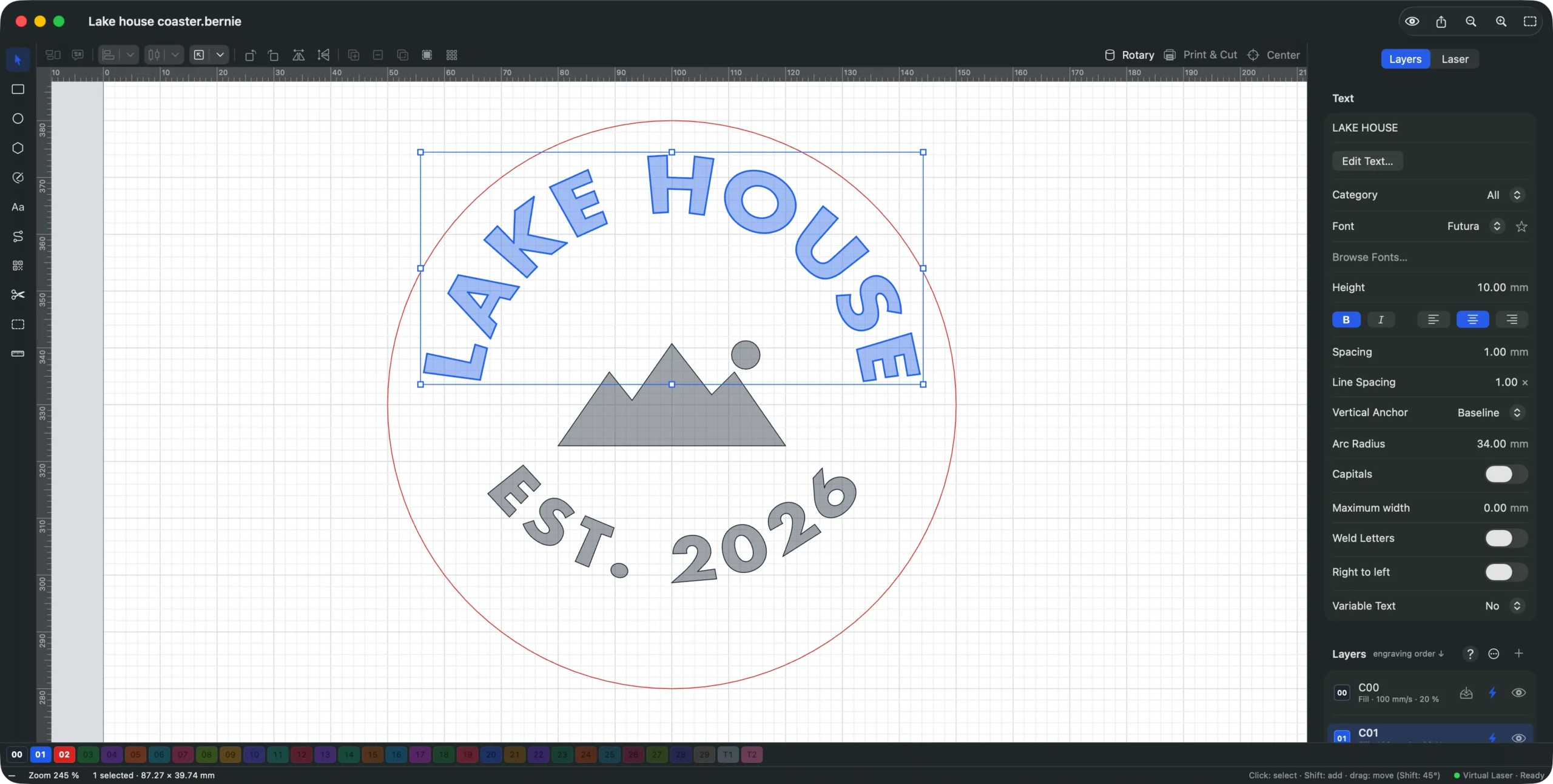
Change the words at any time: the text stays editable, and the arc follows. If a longer name wraps too far round the sides, try a radius a few millimetres larger, a smaller height, or less spacing, and watch the ring update as you type.
Text along any path, or all the way around a circle
For a wave, an oval or a text that runs all the way around, draw the path first (a line, a curve with the Path tool, an ellipse), then select the text and the path together and choose Shapes › Apply Path to Text. The text follows the path, which becomes part of the text and is no longer engraved on its own: duplicate the shape first (⌘D) if you also want to cut it. On a closed shape, the text starts on the left side and goes over the top, outside. In the inspector, Offset along path slides the text, and Vertical Anchor puts it on, under or above the line. With the Nodes tool you can still move the path’s points, and the letters follow; Detach Path gives the path back and straightens the text. The manual’s Text and Codes section lists every text option.
Curve your first text for free
Repeat these steps with your own words and blank: Bernie is free, with no account and no subscription. It runs on Mac, Windows, Linux, iPad and in your browser with Bernie Studio, and the iPhone app is its pocket companion.
Common mistakes with curved text
The bottom text is upside down
If you arch the bottom text the same way as the top one and rotate it, it reads upside down and right to left. Use a negative radius instead: the text bends into a smile and still reads normally. In Bernie, a negative Arc Radius does exactly that.
Top and bottom do not line up
When the two texts use different radii or anchors, one sits closer to the edge than the other and the ring looks lopsided. Give them the same radius (positive and negative), anchor the top one on its baseline and the bottom one by the top of its letters, and center both on the blank.
Letters crowd together or spread apart
Bending a line squeezes the inside of the letters and stretches the outside. Small radii make it worse. Keep the radius at least three times the letter height, prefer capitals, and adjust the spacing by eye.
Script fonts engrave as overlapping outlines
In a connected script, letters overlap where they join. On a fill layer that usually engraves fine, but for a cut or an outline you get a seam at every join. Turn on Weld Letters to merge them into a single outline.
The engraving is off-center on the blank
A design centered on screen can still land off-center on a round blank that is not where you think. Frame the job before engraving, and place the blank against a jig or use a camera: the camera tools help you place a design on the real piece.
Ideas for curved text projects
- Coasters and badges: a name over the top, a date or a place underneath, a small icon in the middle, as in the tutorial.
- Cutting boards: a family name arched over a recipe or an initial; a wave of text along the handle.
- Ornaments and tags: a year around a hole, or a name following the round edge. Our tutorial on how to laser cut Christmas ornaments puts both on an 80 mm ornament.
- Tumblers: on a rotary, a curved text is drawn flat and the cup turns under it; see how to laser engrave a tumbler with a rotary.
- Logos from a scan: if you only have an image of a round logo, convert it to vectors first, then retype the text on an arc so it stays sharp.
Safety stays the same as for any engraving: never laser PVC or vinyl, run fume extraction, wear goggles rated for your laser’s wavelength, and never leave the machine working alone.
Curved text, done in a few clicks
Curving text is mostly a matter of one number: the radius. Work it out from the blank, use the same value positive on top and negative underneath, and the ring looks right the first time. For anything that is not a circle, draw the path and apply it to the text. Bernie does both for free; download it or open Bernie Studio in your browser, and if it saves you an afternoon, a donation keeps it free for everyone.
How do I curve text in a circle for laser engraving?
Set the text on an arc whose radius is the radius of your blank minus the margin and the letter height. Arch the top text with a positive radius and bend the bottom text into a smile with the same radius, negative, so both read left to right. For text that runs all the way round, draw a circle and apply it to the text as a path.
What radius should I use to curve text on a coaster?
Take half the coaster’s diameter, then subtract a margin of about 5 mm and the letter height. On a 100 mm coaster with 10 mm letters, that gives about 34 mm. A larger radius flattens the curve; a smaller one wraps the text further round the sides.
How do I make the bottom text read the right way up?
Use a negative arc radius instead of rotating an arched text. The text then curves like a smile and reads left to right along the bottom of the circle. Anchor it by the top of its letters so it lines up with the text above.
Can I still edit curved text after bending it?
Yes, as long as you keep it as text. In Bernie, a text on an arc or on a path stays editable: change the words, the font or the radius and the curve follows. Only convert it to a path if another program needs plain outlines.
Is there free software to curve text for laser engraving?
Yes. Bernie is free laser software, funded by donations, with text on an arc and text on a path. It runs on Mac, Windows, Linux and in the browser with Bernie Studio, and sends the job to the laser itself.